Violet at the Threshold
Why purple has always meant more than a color

Violet has never been an ordinary color.
It sits near the short-wavelength edge of the light humans can see, where the visible spectrum approaches ultraviolet. Purple, its close cultural companion, is stranger still. Unlike spectral violet, there is no single wavelength of purple light. Our visual system constructs purple from combined signals at opposite ends of the visible spectrum.
The words violet and purple are often used interchangeably, particularly when we are talking about cloth rather than light. But the distinction is a beautiful one. Violet occupies the edge of the visible spectrum. Purple is a color our visual system assembles across separation.
Purple commonly symbolizes power, dignity, spirituality, mourning, transformation, creativity, and resistance. Those meanings are not universal, and they did not emerge from the color alone. They developed through costly materials, religious practice, social rules, political movements, and the communities that adopted—or reclaimed—purple as their own.
Again and again, violet appears when people need a color for something that does not fit neatly into an ordinary category.
Before Purple Meant Power, It Was Difficult to Make
Purple’s association with power begins with material reality.
In the ancient Mediterranean, the family of dyes now called Tyrian purple was produced from marine snails. It required specialized knowledge, extensive labor, and enormous quantities of raw material. The finished cloth did not necessarily resemble the bright grape purple we might imagine today. Depending on the mollusk, process, and exposure to light, the color could move through crimson, wine, red-violet, and deep purple.
What mattered was that it was distinctive and extraordinarily expensive.
Phoenician coastal cities built a valuable industry around the dye. The Metropolitan Museum of Art describes Tyre and Sidon as centers of an economy in which expensive purple dye and luxury clothing played a central role. In Greek and Roman contexts, purple became closely associated with elite and imperial authority, and particular purple garments or bands were restricted by rank at different times.
Purple did not become the color of power by accident. Its symbolism followed its supply chain.
That history is easy to forget now. Modern color often arrives without visible effort: a digital swatch, a tube of paint, a packet of synthetic dye. Natural dyeing restores some of the material story. Color has to come from somewhere. It must be extracted, carried by water, negotiated with fiber, and affected by heat, concentration, minerals, mordants, and time.
For a deeper look at this history, read The Blood of Murex & the Root of the Desert, our essay on Tyrian purple and the long human pursuit of difficult color.
A Color for the Sacred—and for Waiting
As purple moved into religious life, its meaning widened beyond wealth.
In several Western Christian traditions, violet or purple is used during Advent and Lent. These seasons can carry meanings of preparation, restraint, penitence, and expectation. Catholic guidance assigns violet or purple to Advent and Lent, while other traditions and denominations vary in their calendars, shades, and interpretations.
Violet is not quite the black of finality or the white of celebration. It belongs to the interval—the unresolved time before arrival or transformation.
This symbolism is not shared in exactly the same way by every faith, country, or Christian denomination. But the long Western association between violet and spiritual preparation has influenced the way many people continue to perceive it. Deep violet can feel contemplative without being passive. It asks the eye to slow down.
The Color Between Grief and Return
Violet also found a place in the elaborate language of nineteenth-century mourning.
Victorian mourning clothing did more than announce loss. In formalized versions of the custom, clothing could mark stages of bereavement. Deep mourning called for black; later, during what became known as half-mourning, white, gray, mauve, lavender, and purple could gradually return. Surviving garments and historical accounts document violet and purple among these later colors.
Violet was not the absence of grief. It was grief beginning to live beside color again.
Recovery rarely arrives as a clean exchange—sorrow removed, brightness restored. More often, they coexist. Violet was suited to this passage because it could remain solemn without being empty. It acknowledged that a life had changed while allowing the wearer to re-enter the visible world.
Here again, the color occupied a threshold: not the first darkness of loss, not a return to ordinary life, but the complicated territory between them.
Dignity Made Visible
By the early twentieth century, purple had become part of another kind of transition.
The British Women’s Social and Political Union used purple, white, and green in its suffrage campaign. The palette appeared on banners, ribbons, printed material, jewelry, and clothing, allowing supporters to make the movement visible in public life. American suffrage organizations did not all use the same palette: gold held a particularly important place in the United States, while the National Woman’s Party used purple, white, and gold.
That distinction matters. There was no single universal “suffrage color scheme.” What traveled was the strategic use of coordinated color as a political language.
Purple retained its old connection with authority, but it no longer belonged only to rulers. Women wore it while demanding political personhood. A color once used to distinguish the powerful from everyone else became a tool for people insisting that power be shared.
Color could travel where a speech could not. A ribbon glimpsed across a street, a piece of jewelry at a formal gathering, or a coordinated dress at a demonstration quietly said: I am part of this.
Lavender, Stigma, and Reclamation
Purple’s relationship with queer history contains both injury and reclamation.
In the United States, the mid-twentieth-century purge of gay and lesbian employees from federal service became known as the Lavender Scare. Lavender was made into a mark of suspicion within a political culture that treated queer people as dangerous, deviant, or unfit for public trust.
But colors do not always remain in the hands of the people who use them to shame.
In 1970, lesbian activists reclaimed the insult “Lavender Menace.” Members of the group interrupted the Second Congress to Unite Women wearing hand-lettered lavender shirts, confronting the exclusion of lesbians from the women’s movement’s public agenda. What had been intended as a warning became a declaration of presence.
Across queer culture, violet, lavender, and purple developed associations with community, ambiguity, desire, and resistance to rigid categories. Those meanings have never been identical for every person or group. Their importance lies partly in the act of taking a mark of otherness and making it self-chosen.
Purple can lean red or blue, warm or cool, austere or tender. It shifts beside other colors and under different light. Its ambiguity is not a weakness. It is one source of its expressive power.
Why Violet Still Feels Transformative
It would be easy to turn this history into a tidy formula: purple means royalty, spirituality, grief, feminism, or queerness. Color does not behave that cleanly. These meanings emerged from particular materials, institutions, customs, and people. They overlap, conflict, disappear, and return.
What survives is not one definition but a tendency.
Violet appears when a culture needs to make transition visible. It marks the space between grief and return, exclusion and reclamation, earthly authority and sacred preparation. It can represent an established order or announce a refusal of it. It is a color of inherited meaning, but also of meanings being rewritten.
That may be why violet remains so compelling to artists and dyers. It never feels entirely settled.
Violet in the Dye Studio
Natural dyers understand that color is not an abstract promise. It is an outcome produced under specific conditions.
A dye material responds to chemistry rather than symbolism. Plant source, fiber, water, mordant, extraction method, concentration, temperature, and time can all affect the result. The color of a liquid bath is not necessarily the color that will remain on dried cloth, and two fibers placed in similar baths may emerge differently.
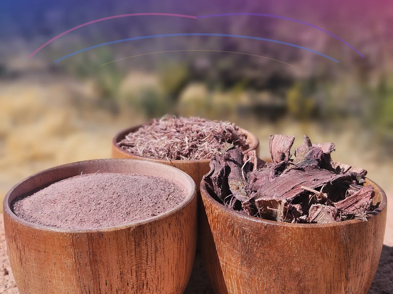
Mimosa hostilis inner root bark contains condensed tannins and has been studied as a textile colorant. Published research reports dyeing cotton with its extract and shows that metal mordants can alter color strength, brightness, and hue. That research does not establish one universal recipe for producing violet, nor does it support promising that every batch will yield purple fabric.
In practical craft work, results attributed to Mimosa hostilis are reported across warm brown, red-brown, wine, burgundy, mauve, gray, plum, and violet-adjacent territory. The responsible way to describe a particular result is to record the actual bark, fiber, preparation, water, temperature, time, and mordant used—and to photograph the dried textile accurately.
Our natural dye color guide explores the variables that can affect the range. Our mordanting guide explains the role mordants play in natural dyeing. As with any botanical dye, a small test swatch is more useful than a promised shade.
Violet sits near the short-wavelength edge of the light humans can see. Beyond it, the spectrum continues into wavelengths our eyes can no longer perceive.
It is a fitting color for the threshold.
Editorial sources
- NASA Science: Visible Light
- PNAS: Wild hummingbirds discriminate nonspectral colors
- The Metropolitan Museum of Art: World Between Empires—Tyre and Sidon
- The Metropolitan Museum of Art: Mourning dress
- Smithsonian National Museum of American History: Mourning in the White House
- Library of Congress: Symbolism in the Women’s Suffrage Movement
- National Park Service: Symbols of the Women’s Suffrage Movement
- Library of Congress: Activism After Stonewall
- USCCB: General Instruction of the Roman Missal—Sacred Vestments
- Erkan, Şengül & Kaya: Dyeing cotton with Mimosa tenuiflora extract
See what changes violet in the dye bath
Explore the practical variables behind mauve, plum, burgundy, gray, and violet-adjacent results.